Every image I deliver begins long before the first slider is moved in Adobe Lightroom. The editing process — how I edit my photos — is where raw technical data becomes a visual story, and for luxury destination weddings photographed across France and Italy, that story must feel both timeless and emotionally true.
How I edit my photos is a question I receive regularly from fellow photographers, from curious couples, and from US wedding planners who want to understand what happens between the shutter click and the final fine-art album. This article walks you through my complete photo editing workflow, the tools I rely on, and the philosophy that keeps my style consistent across every celebration I document.
How I Edit My Photos for a Timeless Look
Reading time: ~12 min
- My Photo Editing Philosophy: Timeless Over Trendy
- Why I Always Shoot in RAW
- Step 1: Import, Organize, and Cull
- Step 2: Crop, Straighten, and Compose
- Step 3: Exposure, Contrast, and the Histogram
- Step 4: White Balance and Color Accuracy
- Step 5: Color Grading with Vibrance, Saturation, and the HSL Panel
- Step 6: Local Adjustments, Retouching, and Dodge and Burn
- Step 7: Noise Reduction and Sharpening
- Step 8: How I Export My Photos for Different Uses
- The Tools I Use to Edit My Photos
- How I Develop and Maintain a Consistent Photo Editing Style
- Bringing It All Together: My Approach and Portfolio
- FAQ
My Photo Editing Philosophy: Timeless Over Trendy
Editing with the future in mind
Before I open a single RAW file, I ask myself one question: what emotion do I want this image to carry in twenty years? That question is the foundation of my entire editing approach. Professional photographers consistently emphasize setting a clear creative intent before touching any slider — and I apply that principle to every frame.
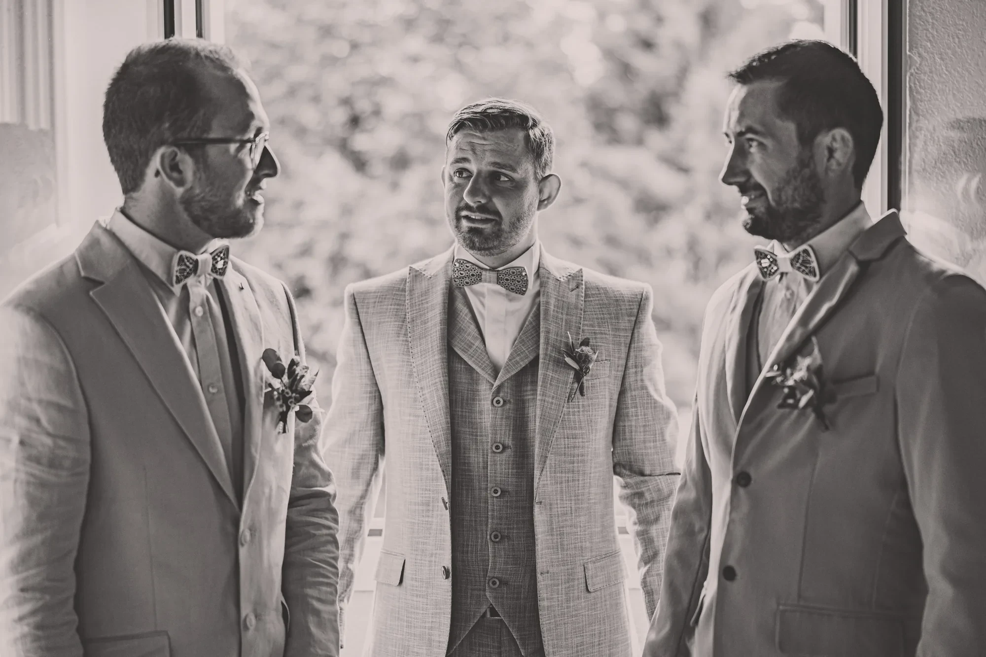
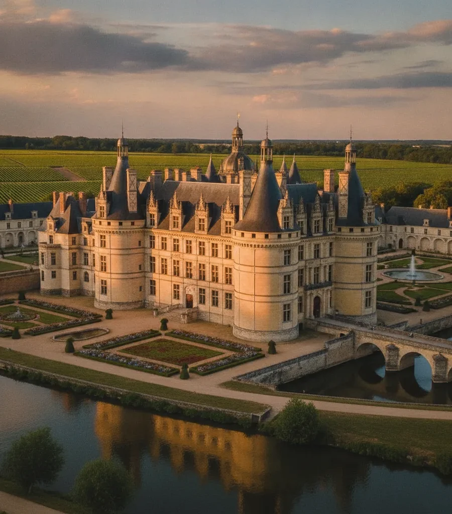
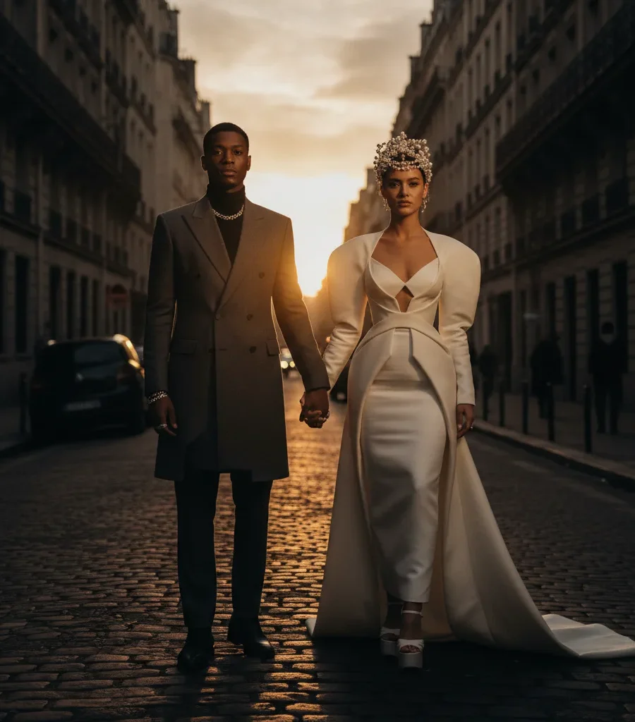
I actively avoid the heavy orange-and-teal color grading that dominated social media feeds throughout the 2010s, the overly desaturated matte look, or any treatment that screams a specific year. My goal is a natural photo editing style where color feels true, skin tones are accurate, and the light looks exactly as it did when the couple exchanged their vows in a Provençal château or on the shores of Lake Como.
This philosophy also protects my clients. When a couple opens their fine-art heirloom album a decade from now, the images should feel fresh and emotionally resonant, not dated by a filter trend. Consistency is equally important. Every frame from a welcome dinner, a rehearsal dinner, the ceremony, and a farewell brunch must share the same tonal balance and color language, even when lighting conditions shift dramatically across a multi-day celebration.
Why I Always Shoot in RAW
Why RAW files give me more control
The answer to whether you should shoot in RAW or JPEG is straightforward for professional work: RAW is non-negotiable. Shooting in RAW gives you maximum flexibility for exposure, white balance, and dynamic range — it preserves the full data captured by the sensor, which means I retain detail in both bright highlights, like a sun-drenched terrace, and deep shadows, like a candlelit dinner hall. JPEG files compress this information at the moment of capture and discard data permanently, leaving far less flexibility during the editing phase.
Shooting in RAW also means that white balance, exposure adjustments, and color corrections are applied non-destructively in post-production. Nothing is baked into the file. I can correct a slightly warm color cast from tungsten reception lighting without degrading the image quality, and I can recover a blown-out sky over a Tuscan vineyard that would be completely lost in a JPEG. For the caliber of work I deliver to high-net-worth clients and US luxury planners, there is simply no acceptable alternative.
Step 1: Import, Organize, and Cull
Starting with organization and culling
My photo editing workflow begins with import and culling in Adobe Lightroom. I use a consistent folder structure organized by event date and celebration segment, so every file from a multi-day wedding is immediately traceable. At import, I apply basic metadata including copyright information and location details.
Culling is the most underestimated step in the entire process. I use star ratings and color flags to identify the strongest images and reject technically unusable frames. For a full weekend celebration, I might photograph several thousand frames and deliver a curated selection that tells the complete story without repetition. Culling ruthlessly before deep editing is an act of editorial respect for the client’s time and attention.
Step 2: Crop, Straighten, and Compose
Once I have my selects, I begin with crop and straighten before touching any tonal or color slider. Composition decisions made in-camera are sometimes refined here, particularly when a slight horizon tilt crept in during a fast-moving first dance or a candid moment during cocktail hour.
I also consider the final use of each image at this stage. A portrait intended for a double-page spread in a fine-art album is cropped differently from one optimized for a vertical Instagram post, where a 4×5 aspect ratio typically performs best.
Step 3: Exposure, Contrast, and the Histogram
With composition locked, I move to global tonal adjustments. I check the histogram first to understand where the image sits in terms of dynamic range. My typical exposure adjustment is conservative, usually a lift of between +0.3 and +0.7 stops for images captured in soft natural light, with a corresponding reduction in highlights to recover any bright areas. I then add gentle contrast, rarely exceeding +20, because heavy contrast quickly makes an image feel harsh and ages it visually.
From there I work through highlights, shadows, whites, and blacks individually. I prefer to open shadows slightly to reveal detail in darker areas of a frame, which is particularly useful when a couple is standing against a brightly lit window or archway. This approach preserves a natural, luminous quality without flattening the image entirely.
Adjusting highlights and shadows independently in Lightroom gives far more control over dynamic range than the contrast slider alone. This is one of the most effective techniques for achieving a balanced, natural look in high-contrast scenes like outdoor ceremonies in direct sunlight.
Step 4: White Balance and Color Accuracy
Prioritizing true-to-life color
White balance is where I invest significant attention, because it directly governs skin tone accuracy and the overall emotional temperature of an image. I use the white balance eyedropper on a neutral reference area when available, then fine-tune temperature and tint manually. For warm golden-hour light at a French Riviera villa, I may keep a slightly warm cast because it is authentic to the moment. For reception images under mixed artificial lighting, I correct toward a neutral, flattering tone that renders white fabrics and floral arrangements accurately.
Color cast is one of the most common problems I see in images that look unnatural or over-edited. An uncorrected green or magenta tint from mixed light sources will undermine even technically perfect exposure settings. Getting white balance right at this stage means every subsequent color decision builds on an honest foundation.
Step 5: Color Grading with Vibrance, Saturation, and the HSL Panel
This is the step where my personal style becomes most visible. I work with vibrance before saturation, because vibrance boosts muted colors while protecting skin tones that are already saturated. A saturation increase applied globally will push skin toward an orange, unnatural result, which is exactly what I want to avoid for editorial-quality portraiture.
The HSL panel (Hue, Saturation, Luminance) is where I do the most precise color work. I use it to refine the specific hue of skin tones by adjusting the orange and red channels, to control the luminance of greens in garden or vineyard settings, and to ensure that floral installations photographed for a planner’s portfolio submission look true to the designer’s original vision.
I also apply subtle color grading in the tone curve and the color grading panel, typically adding a very slight warmth to the shadows and a cool, clean lift to the highlights. This creates depth without pushing the image into an artificial look.
Step 6: Local Adjustments, Retouching, and Dodge and Burn
Global adjustments set the foundation; local adjustments refine the story. I use radial filters and graduated filters to draw attention toward the subject and away from distracting background elements. A subtle darkening of the edges of a frame — what some call a vignette — is applied with restraint so it reads as natural light falloff rather than a heavy filter.
For retouching, I use the spot healing tool in Lightroom and, for more complex work, I move to Adobe Photoshop. My approach to skin retouching is minimal: I remove temporary blemishes but preserve natural texture, freckles, and the details that make a person look like themselves. Heavy skin smoothing is one of the fastest ways to make a portrait look artificial, and it is incompatible with the fine-art documentary style I practice. Dodge and burn techniques are applied selectively to add dimension to portraits, particularly in images destined for album spreads.
Step 7: Noise Reduction and Sharpening
High-ISO images captured during evening receptions or candlelit dinners require careful noise reduction. I apply luminance noise reduction first, then check that I have not lost fine detail in the process, particularly in fabric textures, embroidery, and architectural elements. Sharpening is applied as a final step before export, with masking set to protect smooth areas like skin from appearing artificially crisp.
Noise reduction and sharpening work against each other: too much noise reduction softens fine detail, while too much sharpening amplifies grain. Finding the right balance for each image, rather than applying a fixed preset value, is what separates a professional edit from an automated one.
Step 8: How I Export My Photos for Different Uses
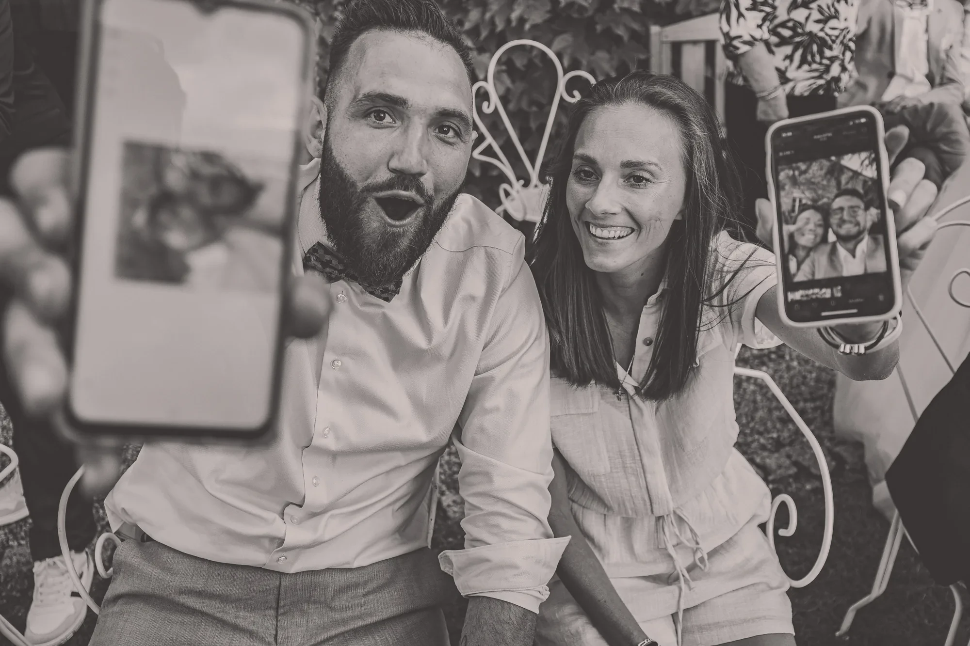
Export settings are not an afterthought. The right format and resolution depend entirely on the intended use of each image. Here is how I approach the most common output scenarios.
| Output use | File format | Resolution | Color space |
|---|---|---|---|
| Fine-art print and album | TIFF or high-quality JPEG | Full resolution (300 dpi) | Adobe RGB |
| Web gallery delivery | JPEG | Long edge 2400 to 3000 px | sRGB |
| Instagram and social media | JPEG | 1080 px wide, 4×5 vertical | sRGB |
| Magazine or blog submission | JPEG or TIFF | Full resolution or per editorial specs | sRGB or Adobe RGB per request |
For Instagram, I always do a final quality check by comparing the exported file against the edited version in Lightroom to confirm that the platform compression has not introduced unwanted color shifts. Exporting for print, particularly for the handcrafted fine-art albums I produce for clients, requires the full resolution TIFF or maximum-quality JPEG to ensure the lab can render every tonal detail accurately.
The Tools I Use to Edit My Photos
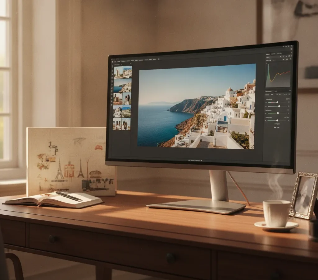
Adobe Lightroom is the backbone of my workflow. It handles import, organization, culling, global and local adjustments, and batch export. Its non-destructive editing architecture means that every adjustment is reversible and every original RAW file remains untouched. For complex retouching, compositing, or any work that goes beyond Lightroom’s capabilities, I move into Adobe Photoshop, using Camera Raw as a bridge when needed.
I do not rely on heavy presets as a shortcut. I have developed a base starting point through years of refining my style, but every image is edited individually because every lighting situation, every venue, and every couple is different. A preset applied uniformly across a full wedding gallery is one of the clearest signs that an editor is prioritizing speed over craft, and that is not a trade-off I am willing to make for clients who have invested significantly in their destination celebration.
How I Develop and Maintain a Consistent Photo Editing Style
Workflow habits that keep my edits consistent
Consistency across a multi-day event is one of the hardest technical challenges in destination wedding photography. Light changes from morning to evening, from an outdoor ceremony to a candlelit dinner, from a bright Riviera afternoon to the interior of a centuries-old château. My approach to maintaining a consistent style relies on three principles.
First, I calibrate my white balance decisions against the same reference standard throughout each event, so that the color temperature feels coherent even as the light source changes. Second, I edit entire events in a single session where possible, so that my eye is calibrated to the same visual standard throughout. Third, I compare images across the full gallery before export, checking that the tonal balance and color language hold together from the welcome party to the farewell brunch.
This level of attention to consistency is precisely what US luxury planners need when they submit a multi-day celebration to a prestigious publication. Every image in that submission must feel like it belongs to the same visual story.
Bringing It All Together: My Approach and Portfolio
How I edit my photos is ultimately a reflection of how I photograph: with restraint, intention, and a commitment to images that will remain meaningful long after the trend cycle has moved on. The technical steps — from RAW capture through exposure adjustment, white balance, HSL refinement, local adjustments, noise reduction, and export — are in service of a single goal: delivering images that feel true to the moment and beautiful without effort.
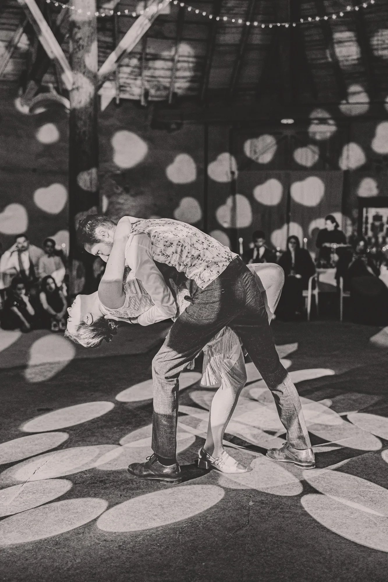
If you are a couple planning a destination wedding in France or Italy, or a US planner building a vendor team for a complex multi-day event, you can learn more about my approach and portfolio on my website.
FAQ
What is the difference between vibrance and saturation in photo editing?
Vibrance selectively boosts the intensity of muted, less-saturated colors while protecting tones that are already highly saturated, particularly skin tones. Saturation increases or decreases the intensity of all colors in the image equally, which can quickly push skin toward an unnatural orange result when applied globally. For portrait and wedding photography, vibrance is almost always the safer and more flattering tool.
Should I shoot in RAW or JPEG for easier editing?
RAW files give you significantly more flexibility in post-production, particularly for recovering highlights and shadows, correcting white balance, and making precise color adjustments without degrading image quality. JPEG files are smaller and immediately shareable, but they compress and discard data at capture, leaving far less room to correct or refine the image later. For professional or high-stakes photography, RAW is the standard.
What software do professional photographers use to edit their photos?
Adobe Lightroom is the most widely used professional editing software for organizing, culling, and adjusting large volumes of images. Adobe Photoshop is used for more complex retouching, compositing, and pixel-level work. Camera Raw, which is integrated into both Photoshop and Lightroom, provides the same core RAW processing engine. Some photographers also use Capture One as an alternative to Lightroom, particularly for its color science.
How do I fix grainy or noisy photos after editing?
Grain and digital noise typically appear in images shot at high ISO values in low-light conditions. In Adobe Lightroom, the Detail panel offers luminance and color noise reduction sliders. Increasing luminance noise reduction smooths out grain but can soften fine detail, so use the masking slider to protect areas with texture. Applying noise reduction before sharpening, and balancing both carefully, produces the cleanest result without an artificial, over-smoothed appearance.
How do I export photos for Instagram without losing quality?
Export your image as a JPEG at maximum quality, with the long edge set to 1080 pixels for square images or 1080 pixels wide for vertical posts. Set the color space to sRGB, which is the standard for screen display. Instagram recompresses uploaded files, so starting with a clean, correctly sized export minimizes the quality loss from that compression. Always preview the exported file before uploading to confirm that colors and sharpness have been preserved.
How do I develop a consistent editing style across all my photos?
Consistency comes from editing with intention rather than applying a fixed preset mechanically. Start by defining the visual qualities you want your images to share: a particular tonal balance, a color temperature, a level of contrast. Edit full events or sessions in a single sitting where possible, and compare images side by side before export to check that they feel cohesive. Over time, your instincts for these decisions become faster, and your style becomes recognizable without feeling repetitive.